Choosing the Right FX Derivatives Strategy Is Complex— Here’s a Better Way
Using derivatives to manage FX risk is a common and effective strategy- when done right. Unfortunately, that’s the tricky part. There are about a gazillion different options and structured products the quants have thought up, with unhelpful names like forward extra, Bermuda option, Barrier, or TARF. Whether you’re a corporate CFO, the GP of a fund, or a bank account executive trying to help your clients, navigating this ocean of possibilities can feel daunting. Fortunately, help is here.
Why Traditional FX Payoff Diagrams Fail in Hedging Strategy Comparison
Traditionally, an account executive would present several hedging alternatives, with text descriptions of the payoff, and payoff diagrams to their client. If an end user, the CFO or Treasurer would have identified multiple alternatives themselves. The difficulty is in the selection- how do you evaluate and measure the efficacy of each product? Here are payoff diagrams for 3 strategies (Collar, Seagull, Put). Which one is best?

While payoff diagrams are not untrue, they are remarkably unhelpful. Why? Because for any value of the spot rate (which might look very good!) you have no idea what the likelihood of that outcome is. We need a better tool to evaluate relative performance, one that includes information about likelihoods and value. Back-testing is not the answer- that is the one path that will never, ever be replicated. The answer is in simulation- looking forward.
How Market Simulations Improve FX Strategy Evaluation
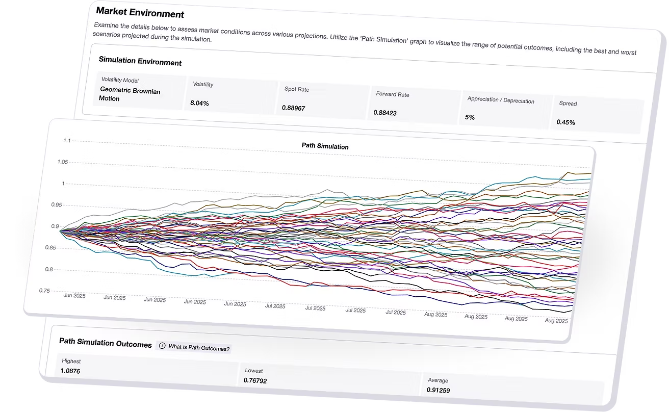
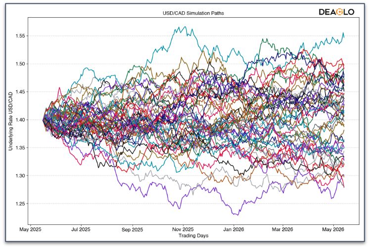
Simulating a market involves mimicking a market over many possible iterations and outcomes (5-10,000), over the tenor of interest, such as 6 months, or a year. There is a lot of math involved in creating these paths. At a minimum, you need to replicate the average volatility and any trending that might be evident. More advance simulation techniques take into account that volatility is not constant – it varies, and also clusters. In real markets, there are times of steady, quiet, interspersed with wild and crazy times. And sometimes, Black Swan events create large discontinuities (e.g. 9/11, Lehman recession, Covid 19). Realistic simulations need to replicate these behaviors. Fig 2 shows a simulation of paths.

Now that we have our simulated market paths, we can use them to evaluate our strategies. This is tricky! How will we represent the outcomes of three or four strategies over 5 or 10,00 paths so that we can interpret them easily?
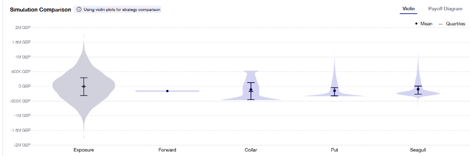
One way is to use violin plots. Violin plots show probability “densities”, which represent the likelihood of an outcome. The wider the plot at that value, the more likely it is to occur.

Visualizing Hedging Outcomes Using Violin Plots
Now that we have our tool for visualizing thousands of data points, we take the last step – show the violin plots for each of the strategies together, so that we can visually compare their performance. Fig 3 shows violin plots for several hedging strategies. The Y axis shows the gain or loss. NB: the strategy violins include the net cost.

How to Compare FX Strategies: Mean, Variance, and Tail Risk
So how do we interpret these plots? We need to have some idea of a metric to compare them. There are many candidates:
1) Mean value. This is the average of all the outcomes. Note the mean of the unhedged exposure is zero (or nearly so). If the mean of one strategy is higher than another, it’s ‘better’.
2) Variance. The main goal of risk management is to reduce the variance of the outcome. The Exposure plot on the left exhibits high variance, and all the hedged outcomes show a far lower variance, some more than others.
3) Tail risk. Sometimes fx hedging strategies include multiple sold options to offset the cost of the long or hedging option. If one of these short options gets into the money, it will generate a loss. In Fig 3, only the Seagull shows any tail risk.
Scenario Analysis in FX Hedging
When running simulations, it can be useful to explore different scenarios. For example, using historical volatility is just part of the picture. What if the volatility was lower? Then products with sold legs would show better performance (because the sold legs would be less likely to be in the money (ITM). What if the volatility was higher? Then the opposite would be true, and tail risk would be exposed. What if, instead of a zero biased market you introduce a trend? Lots of experiments can be run to ensure that your strategy will be safe and effective under any regime.
About the Author
Paul Stafford is the CTO of Deaglo, specializing in quantitative finance and derivatives. He leads the development of advanced modeling tools that help financial institutions, funds and corporates make smarter, data-driven hedging decisions.

